
After my first experiment creating digital prints from code, the Web Moons Series, I wanted to continue exploring the ideas of color and layering with this web-based medium. After some experimentation, I created another smaller series of prints inspired by the CMYK color model.
I learned about CMYK, which stands for Cyan, Magenta, Yellow, and Key (Black), when I studied printmaking in college. CMYK is a subtractive color model used in color printing. What does that mean and how does it work?
Wikipedia offers a great explanation:
“The CMYK model works by partially or entirely masking colors on a lighter, usually white, background. The ink reduces the light that would otherwise be reflected. Such a model is called subtractive because inks ‘subtract’ the colors red, green and blue from white light. White light minus red leaves cyan, white light minus green leaves magenta, and white light minus blue leaves yellow.”
One of the most advanced traditional printmaking techniques is reduction printmaking, which is also a subtractive process and shares similar concepts to the CMYK model. In a reduction print (usually a wood or linoleum block), you first carve out everything in the image that you want to remain white or whatever color the paper itself is, and select an edition size. You then print each edition number with your first ink color. You repeat this step a number of times with colors in order from lightest to darkest until you’re left with only the part of the image you want to print in your darkest color (usually black). The block that you are left with is called your key block. This process often feels risky because you are making changes to the same block or printing plate for the entire process, leaving little room for error.
In my experience, the trickiest part of making physical reduction prints is the registration aspect, or making sure your paper is perfectly aligned with your block for each run of the printing press. While there are techniques to ensure perfect registration, when you mess this up, your image will come out looking kind of blurry and funky!

You can also make multi-colored prints using separate blocks, but you still need to register them so their alignment is correct.
Here is the reduction print I made in college, Pink Cadillac. You can see where the registration was slightly off around the edges and in some places in the print like the pink edges on the clouds. Though not technically perfect, I think the registration flaws add a cool vintage vibe. For this image, I printed the pink first, then the blue, then the green, then the black:

Pink Cadillac reduction linoleum print. Image courtesy of Jessica Farrell.
When I first started learning to code, I gravitated to using the CMYK color palette to inject some fun and brightness into the simple apps I was building, like tic tac toe:
 The CMYK Series combines my interest in experimenting with layering and drawing circles with code with that iconic color palette.
For this series, I wanted there to be less emphasis on the whitespace in each piece, and more emphasis on the bold colors and how they overlap to create super saturated layers. I bumped up the size of the circles to make them bolder and bigger and continued to rely on randomization for each composition.
After several test batches experimenting with circle size and color opacity (or saturation), I initially created 100 images, which I then narrowed down to 40 which met the following criteria::
- No circle can be fully covered by another i.e. there must be some of the original color present, even if just a tiny sliver, unless the circle goes off the page
- Every circle had to be overlapping with at least one other circle. This was easier to achieve as I increased the overall sizes of the circles, but I wanted to ensure there were a lot of “Venn diagram” moments, revealing slivers of new colors as colors overlapped.
From the set of 40, I curated 20 of my favorites as the final series of prints. I also curated an additional set of 20 that will be available as NFTs only on OpenSea.
Here are a few of my favorites from these sets:

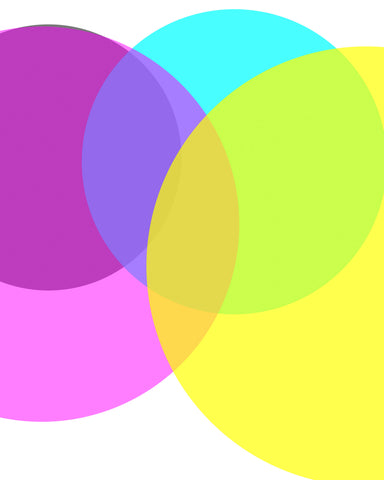
CMYK 1
I love how each color overlaps with each other color in this one, and how all of the circles are clustered to the right. The colors take up most of the image without being overwhelming, and each circle has a similar level of saturation, creating a some nice layering moments.
I like that this piece is mostly about the cyan, magenta, and yellow, with the black circle hiding in the background and only a tiny sliver peeking out. The different shades of purple, and the green from the cyan/yellow overlap are a fun combination. I also like the negative space created at the top and bottom of the composition.

CMYK 10
I love the boldness of the black circle in this piece - it’s taking up space, but still transparent enough to let the magenta and cyan show through. It also doesn’t weigh down the composition, despite its position in the upper left corner.

I love that magenta is the star of this piece - seeing the magenta overlap with both cyan and yellow to create a blueish purple and reddish pink is really stunning. I also like that the magenta and black are just barely overlapping by a tiny sliver.
You can see the entire collection of prints here!